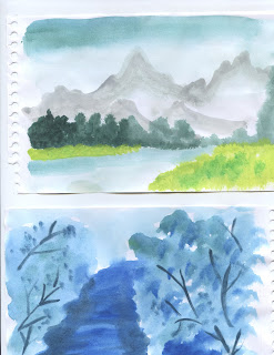
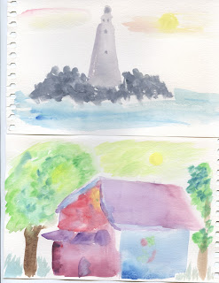
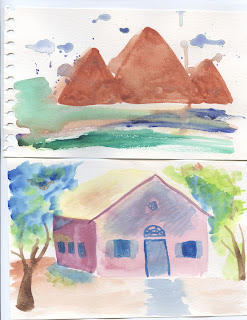
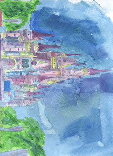
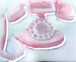
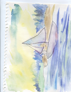
All of these pieces were a mix of gouache, watercolor, line art, and digital art. Alice was a redo, because the first one sucked. I like her a lot more now, she looks a lot more realistic and interesting. I spent a long time on her. I chose to digitally draw the cheshire cat in the background to add a more interesting element to the piece. Although it may seem that Alice is more illustrated and the cat is more digital, I feel it fit the piece because the cat is part of her imagination and through a child's eye, imagination characters usually appear more cartoon like. The next piece is my extra piece. I chose to do a concept of two contrasting elements; a modern looking model with a modern dress, and a natural background to create strong contrast. I really like the way it turned out. Next was my 3 image gouache. I chose to do a diet coke can, a shoe, and my sister. Both the shoe and coke can represent my sister because they are both things she loves. It took forever to do her face. The next piece was the society of illustrators piece. I chose to do a line art drawing of the Eiffel tower and a awesome colorful wash to only the tower. It turned out Awesome!!
Monday, December 10, 2012
Saturday, December 8, 2012
Thursday, December 6, 2012
Angry Asian.
Wednesday, December 5, 2012
FINAL CHOICES
Labels:
9,
Illustration,
line art,
mermaid,
painting,
wash,
watercolor
Monday, December 3, 2012
Tuesday, November 27, 2012
Saturday, November 10, 2012
Monday, November 5, 2012
Monday, October 22, 2012
Wednesday, October 10, 2012
Mid Term Portfolio. A FOR AWESOME
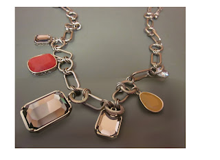
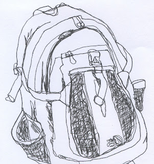
As you know, I have worked with a variety of mediums such as ink, watercolor, gouache, and digital. My favorite would probably have to be watercolor, because of the fact I think that I have mastered that better than anything else. I really hope you think I have done better than "C" work, otherwise my grandmother may disown me. She is a watercolor artist, and chinese so she has standards. Something that I wanted to keep consistent in my work is to chose subject matters that I like or find interesting. I think things are less cool if they are just random things you find in your dorm and don't say anything about the artist. For example, yes I could have done a food container for my product illustration, but I chose instead to do something harder- a necklace given to me by my mother. So precious. Another object I chose that was a pain in the butt to do was the motorcycle. It was HARD. But its for my brother because its his motorcycle, and I prefer art to be gifts. That way you are not only giving the person an item, but part of your time and effort. Which also saves me money too. Well, never mind I spent most of my life savings on art supplies and print receipts. Help me, I'm poor. Something I've enjoyed in your class so far is getting better, I like doing your homework. If only I had the time to do it better. Classes are taking over my life. If I only had my art classes, things would be all good. But this is not the case. Apparently Truman believes "government" and "language" to be important. Some things that I have not enjoyed about your class is the 7:30am thing. Its kind of killing me. Mornings SUCK. That is all.
Monday, October 8, 2012
Saturday, October 6, 2012
Monday, October 1, 2012
Friday, September 28, 2012
Subscribe to:
Comments (Atom)


